Wow Potato

Wow Potato
DirectionBrandingMascot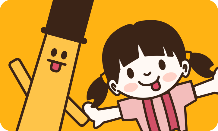
Project Detail
- Year
- 2024
- Medium
- Character Driven
- Tools
- Figma
- Product link

Wow Potato turns a plate of fries into a whole cast of characters, Furaido-san and Hana-chan carrying premium potato snacks with the same charm as a mascot brand twice its size.
The Design
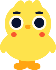
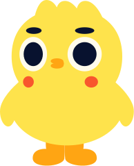
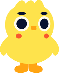
Wow Potato brings premium fries to life with playful design and its lovable characters, Furaido-san and Hana-chan, creating a fun and memorable snack experience.
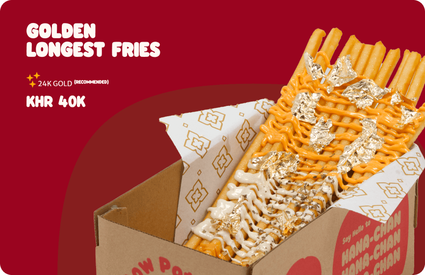
Golden Longest Fries, the flagship box, with Furaido-san front and center holding up the brand's whole bit: everything's longer, everything's louder.
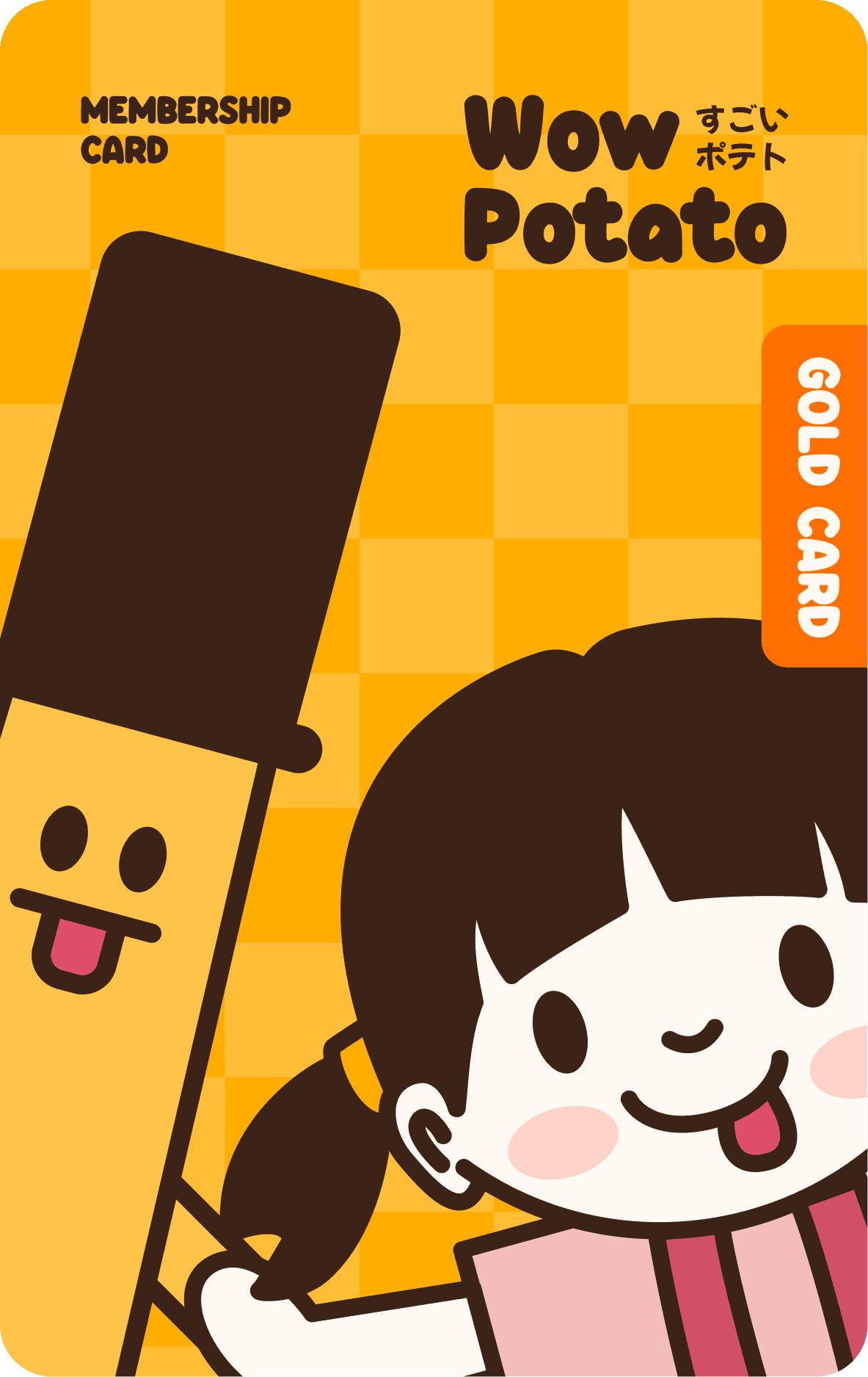
The everyday card, Furaido-san's warm-up before the bigger campaigns.
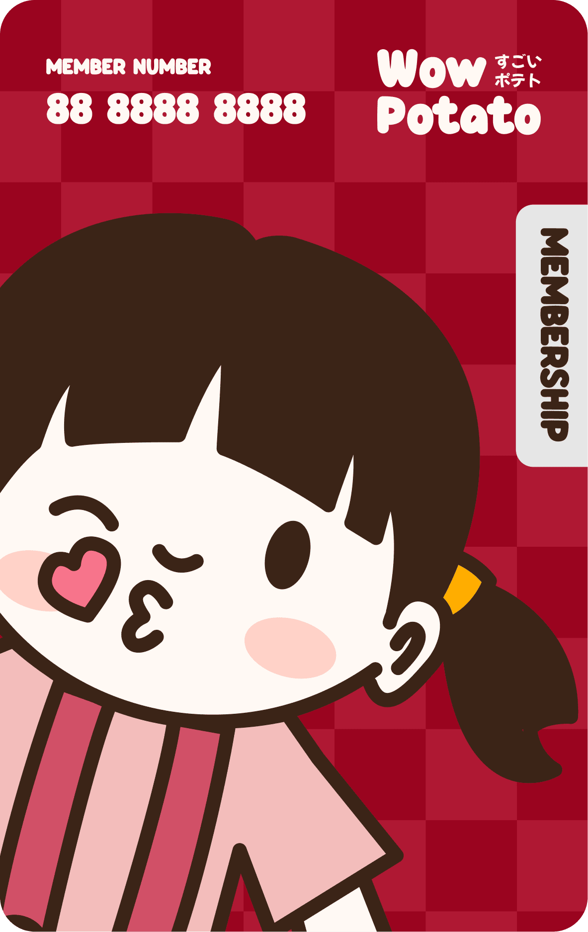
Hana-chan's version leans darker and classier, same brand, a different mood entirely.
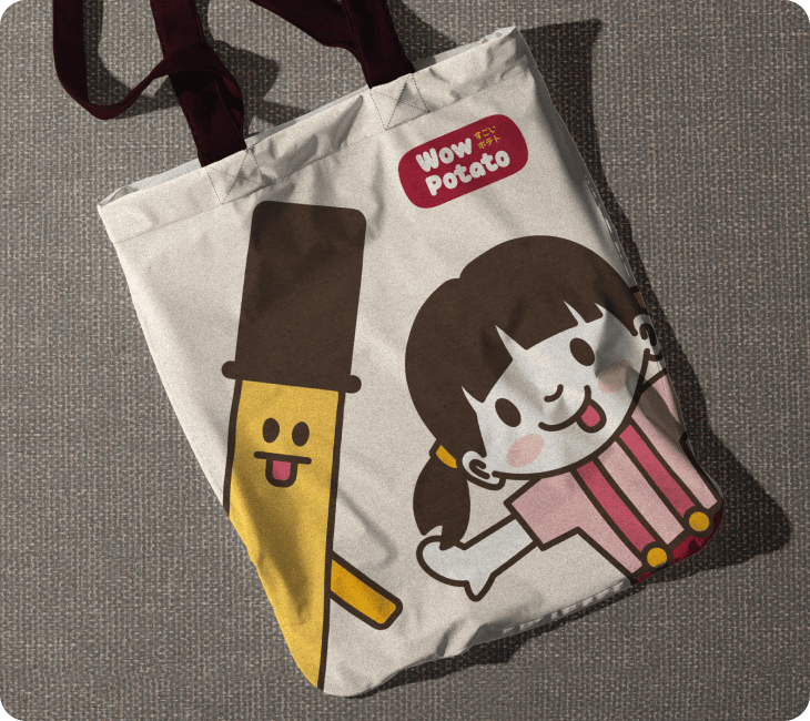
A canvas tote turned the mascots into something people carry around outside the shop.
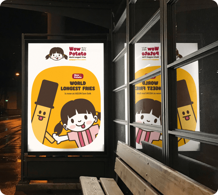
An advertisment on the window, the mascots are the first thing people see when they walk by.
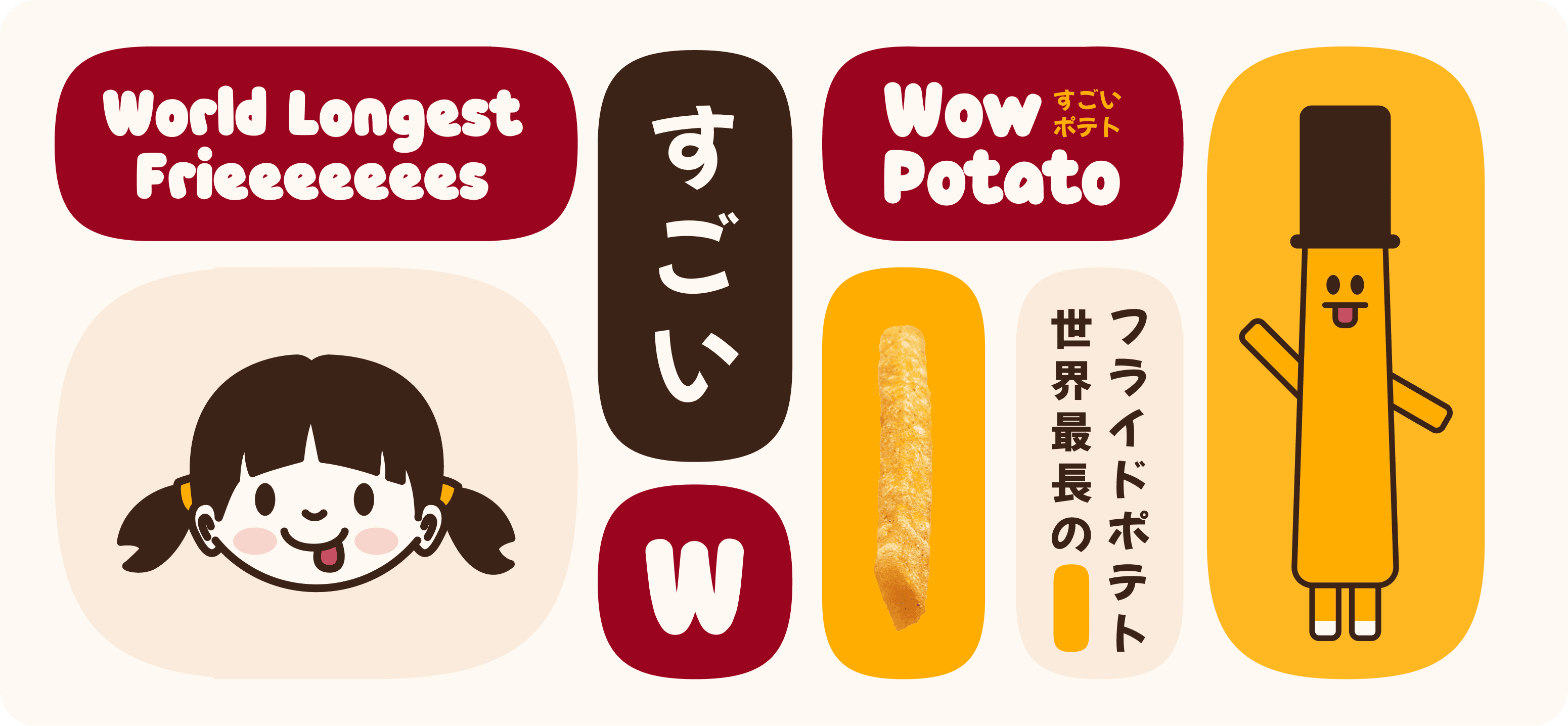
An implementation of squircle, easy for other designers to try.
The Process
Before Aok and Hana ended up on boxes and stickers, they went through rounds of turnarounds, wordmark studies, and pattern tests along the way.
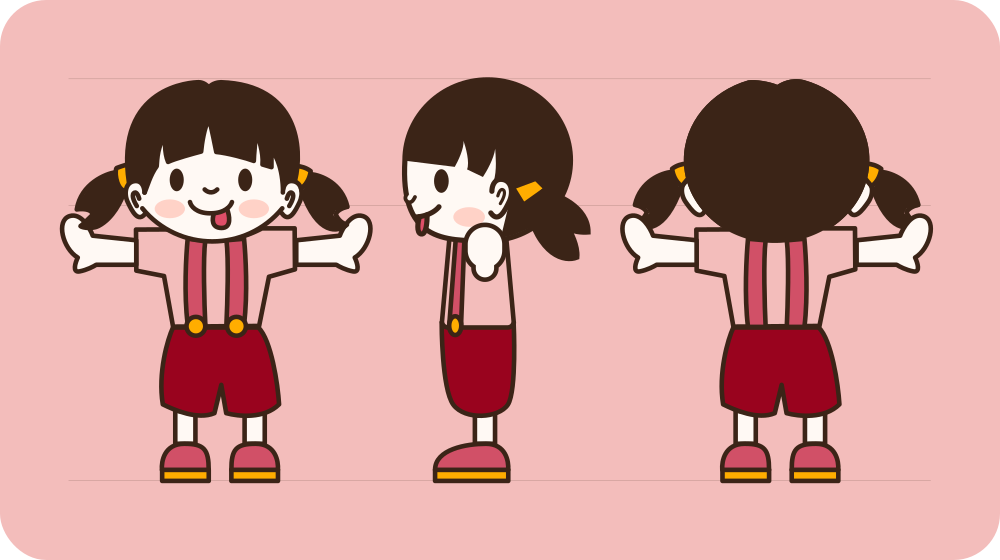
Hana-chan's turnaround, front, three-quarter, and back, so she reads the same whether she's on a cup sleeve or spun sideways on a sticker.
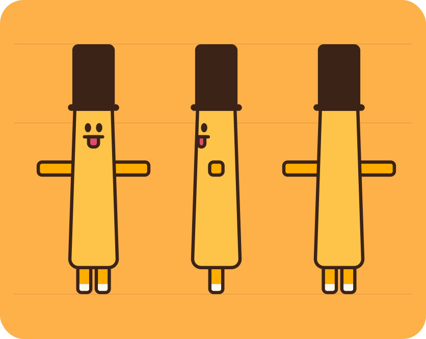
Furaido-san's version needed more passes, that top hat had to survive being flattened onto small packaging without turning into a blob.
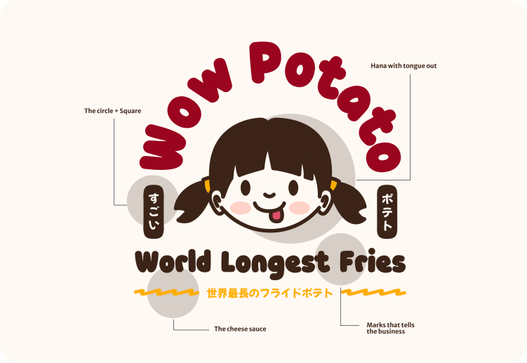
The wordmark went through several iterations, the final version is a mix of Japanese-style lettering and a squircle shape that can be used as a standalone icon.
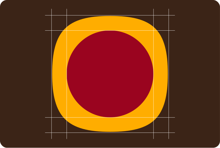
The core of the brand, Squircle, a shape combined between a square and a circle, used as a standalone icon mark and as a background texture.
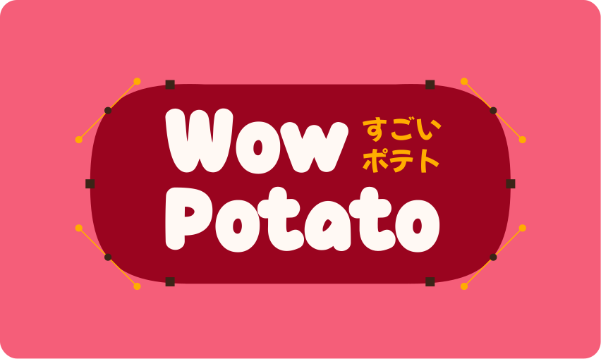
Another variation of the logotype, this one is a letter-only version that can be used when the mascots aren't needed, but the brand still needs to be recognizable.
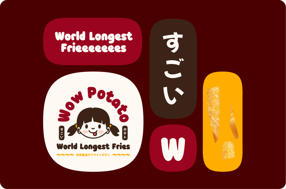
The scale of implementation of Squircle, the repeating pattern can be used on packaging, merch, and even as a background texture for social media posts.
Open Telerehab